Oops I Redesigned Again
I did it again. I redesigned my website. Think I'm crazy? Come and see why it was worth the effort.
Aug 28, 2022
Ok, so, it's happened again. I decided to rebrand...slightly. Let's talk about how we got here.
Streaming on Twitch
For anyone who doesn't know, I started streaming web development content on Twitch back around April of 2022. We've done a lot of cool things and played around with a bunch of really interesting technologies, so if you haven't dropped by, here's my self-promotional plug to come check out the stream and jump into the Discord server to hang out with our amazing community even while I'm not streaming!
Anyways, as part of my streams, I like to reach out to the folks in chat and on Twitter to see what they would be interested in doing or building. A few months ago, someone asked whether it would be possible to have a whole stream where we go through the design process of building a website. I'm no designer, but I agreed, figuring that we could design a portfolio site for developers that we could open-source and give back to the community. You might be able to see where this is going.
For those who were on that stream, you might remember my crisis right at the end of the night. We had designed a really awesome looking portfolio site, but I liked it so much that I wanted it for myself. There were a few things that I didn't love about my existing website, and this design seemed to fix a lot of those issues. To make a long story short, I decided that, even though it's only been a few months, it was time to do a redesign and a slight rebrand.
The Redesign
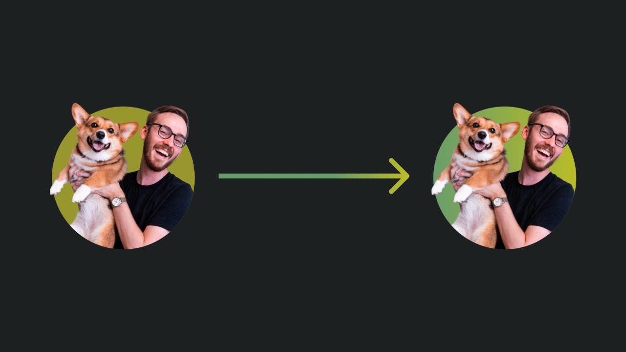
Looking at the two sites side-by-side, it's likely that you would say the two are almost identical, and you'd be right. The direction that I took for my January 2022 redesign was a huge step in the right direction after YEARS of floundering around, trying to figure out what my own personal brand was. This redesign was really just the polish on top of the idea that I laid out in my blog post from earlier this year.
Here are a few of the areas that were in the most serious need of an upgrade this time around:
Font Choice
I love the IBM Plex fonts. They're fantastic, easy to use, and open source! However, I made the decision to use the monospace version of the font for all of the body text on my previous website in order to make it look more "developer-focused". This was definitely not the right approach. For a website to be "developer-focused", it has to be friendly and easy to use for developers, but instead, I had gone in the direction of making it look like something that a developer would have designed. Monospace fonts are hard to read in dense blocks of copy like paragraphs. They certainly can work, but it's hard to get the design just right, and it takes much more than my passing knowledge of design to iron out the details.
Knowing that, this time around I opted to go for a simple sans-serif font for all of the body copy. Immediately, the copy got easier to read quickly, which is much more friendly to developers looking to extract some sort of information from the site. My intention was to use IBM Plex Sans, one of my favorite fonts, but I found my current font (Thicccboi) and just had to use it. I mean, with a name like that, how could you NOT? Regardless, I ended up liking the font so much, I used it universally for my website–buttons, paragraphs, headers, and everything in between got the Thicccboi treatment.
Flat Design w/ Flat Colors
I've always been a big fan of simple, flat designs. There's something about the simplicity that draws me to these sorts of sites and apps, so I wanted to emulate that as much as possible. My previous design was my first attempt at flat design, but it was missing something. Previously, I had tried to marry flat design with too simple of a color palette. The only accent color was the light yellow-green color that is present in this design as well, but since the design was flat and simple, I needed a little bit more to the accent color.
Now, I have a green gradient color that fulfills this accent color need. It's not much more complex than the original light yellow-green color (and in fact, the gradient includes this color), but it adds just enough variety to give the design some life.
Use of Space
Along with simple, flat designs, I've always been partial to website designs that don't try to do TOO much with their layouts. I think there's a beautiful, subtle artistry to making the most of the space you have without looking like there's too much information crammed into every empty corner of the design, and I tried to capture that as much as possible in my previous design. Unfortunately, the design fell victim to the "mobile-first" curse–everything was a single column layout. While not bad by any means, this single-column layout being repeated over and over again across the site gave the impression that this was a website that had been designed on mobile, then scaled up to fit other viewport sizes.
This time, I made sure to spend a little bit more time on the larger desktop viewport to make sure that the design was interesting, but also maintained its simple aesthetic that I love. What came from the extra time was the ability to break out of the single-column layout into a two-column layout. While this doesn't seem like a huge departure from my previous site, it makes a huge difference in how the pages flow and look on larger viewports.
Final Thoughts
Overall, I'm a big fan of this redesign. I didn't so much reBRAND as I did reDESIGN, and I think that's ok. My goals haven't changed all that much from when I rebranded in January, so keeping the same underlying principles saved time and prevented me from duplicating work. The new design is, in my opinion, lightyears better than the old one. It's timeless, interesting to look at, and, most importantly, easy to use.
But what do YOU think? Drop me a line on Twitter and let me know what you think!